Increasing leads by 300%
GOAL
The objective of the client’s brief was to increase leads. Basically, they needed more quality applicants.
SOLUTION
To meet the goal, the entire lead generation funnel (process) would have to be redesigned. I tailored the end-to-end recruitment and application product to prioritize the content and interactions of the user to provide value, community, resources, and engagement for those interested in participating in a year-round volunteer position.
PAGE CONTENTS
0.1
Assessment
Year-Round Volunteering Form and Application
LANDING PAGE
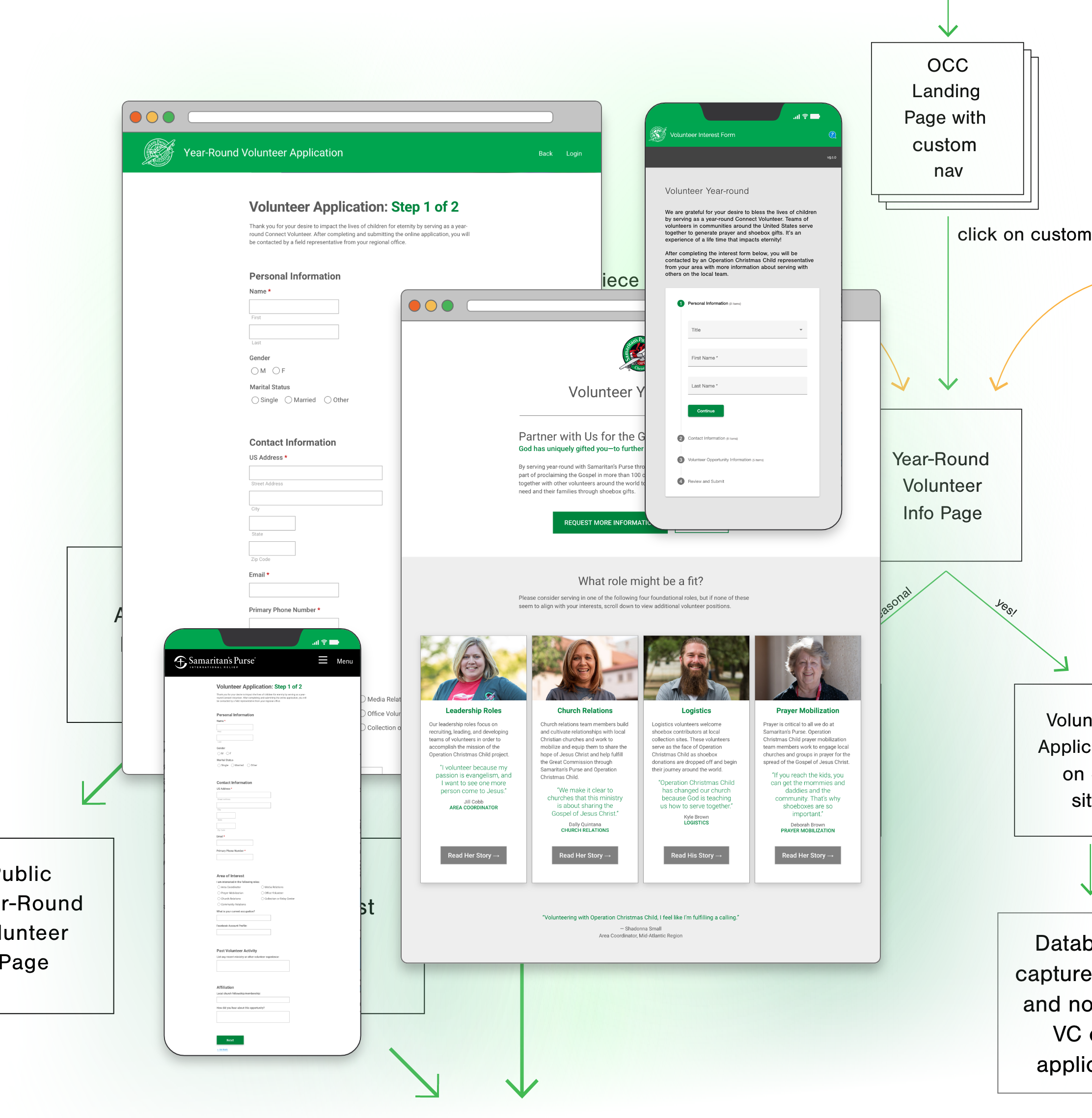
- No clear hierarchy
- Confusing/competing information
- No point of entry to the Application
- Point of entry to the interest form is a text link (circled in red) with no clear affordances
APPLICATION
- Must have direct link to access application via a physical mailer, or word-of-mouth at the company corporate conference; no point of entry on corporate website
- Direct link points to a page containing two tabs of a wall of text
- Applicant is asked to review the info on both tabs before completing application
- Both tabs have an entry point for the application; user = confused
0.2
Data Audit
Year-Round Volunteering Application
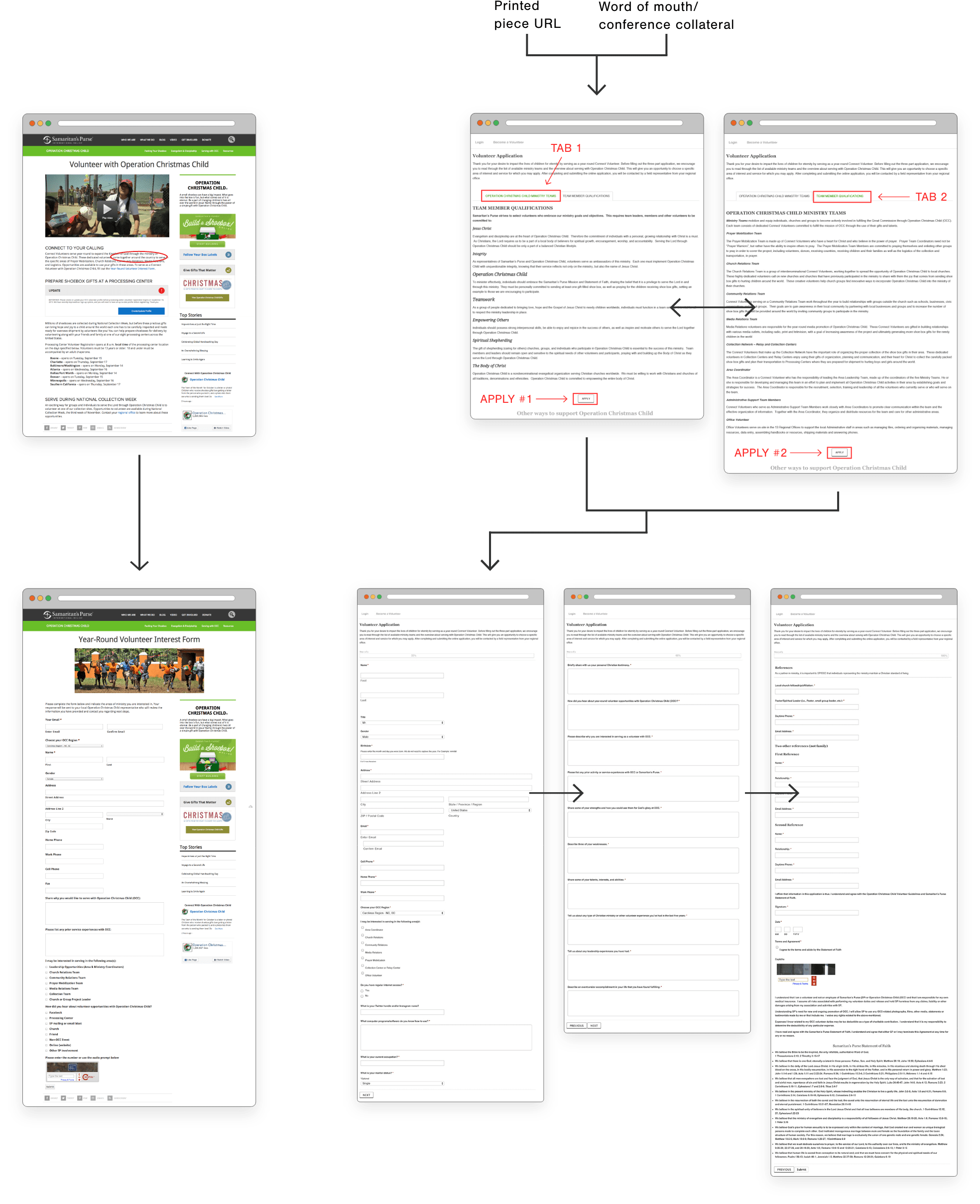
CLARIFYING DATA COLLECTION PROCESSES
- Created a 2-step application process
- Transferred weight of the process onto internal resources to ease the burden on the user in the hopes of lowering abandonment
- Mapping shows internal processes and what purpose each serves
- Clarified processes and data collection points that needed to be incorporated in redesign
- Clarified goals based on data collection needs and constraints
ORIGINAL GOALS:
- To get fresh blood
- Younger volunteers (20s and 30s)
- Make sure applicants have a strong ministry fit
- Applicant has an understanding of what an actual year-round volunteer does
REVISED GOAL:
- Help the motivated applicants to successfully finish the application process
KEY:

Step 1: actions taken by applicant

Step 2: actions taken by company
0.3
Re-Mapping
Year-Round Volunteering Application
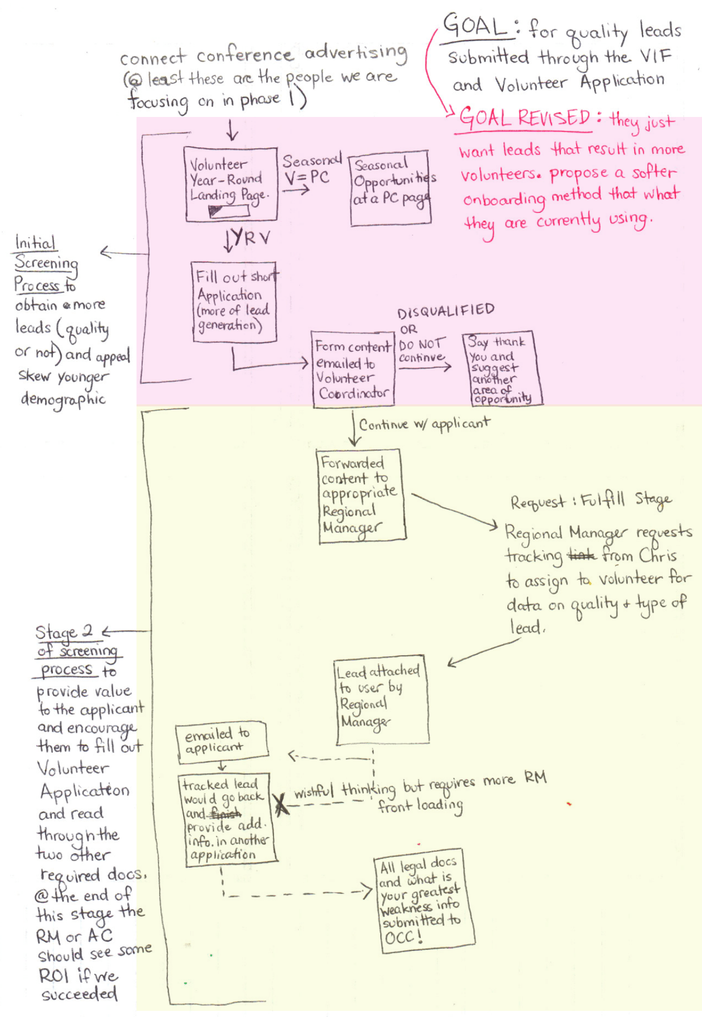
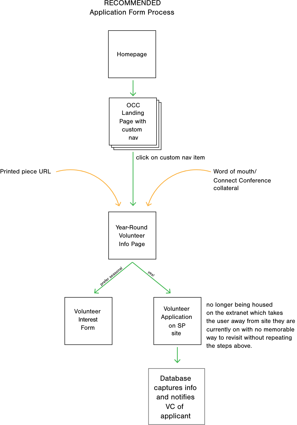
Revised Application Workflow
Instead of the applicant doing all the heavy lifting and filling out a cumbersome form, much of the weight has been transferred back onto the Volunteer Coordinator and her team to follow up if they want any information beyond what is immediately necessary for the applicant to be considered a qualified lead.
KEY:
Source of lead
Workflow
Problematic and confusing points

0.4
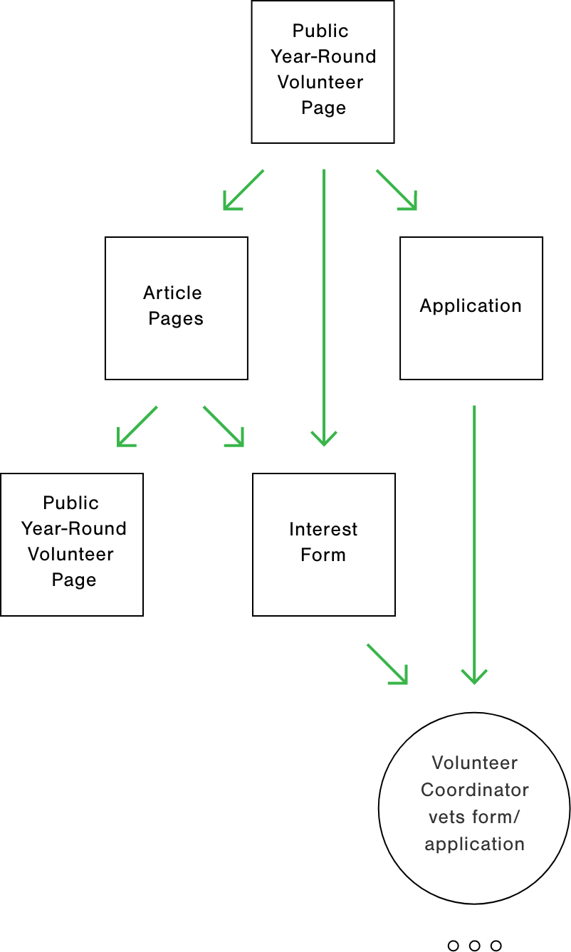
New User Flow
Year-Round Volunteering Form and Application
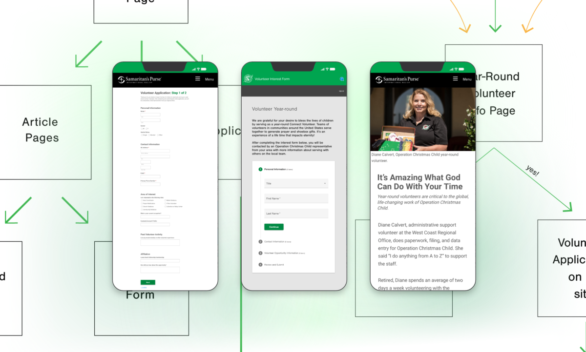
LANDING PAGE UPDATES
- The landing page becomes the conversion funnel for BOTH the interest form and the application
- The interest form is the prominent CTA
- Articles about different positions were created to add value to the user, while educating on the different roles, enabling the user to determine which role is the best first for them (replacing the two tabbed information pages at the beginning of the previous application form)
APPLICATION UPDATES
- Reduced from 5 pages to 2 pages
Interest Form Updates
- Simplified the interest form page
- Organized content clearly and concisely
- Requested only required information for vetting
0.5Content Wireframing
Year-Round Volunteering Funnel Entry (Homepage)
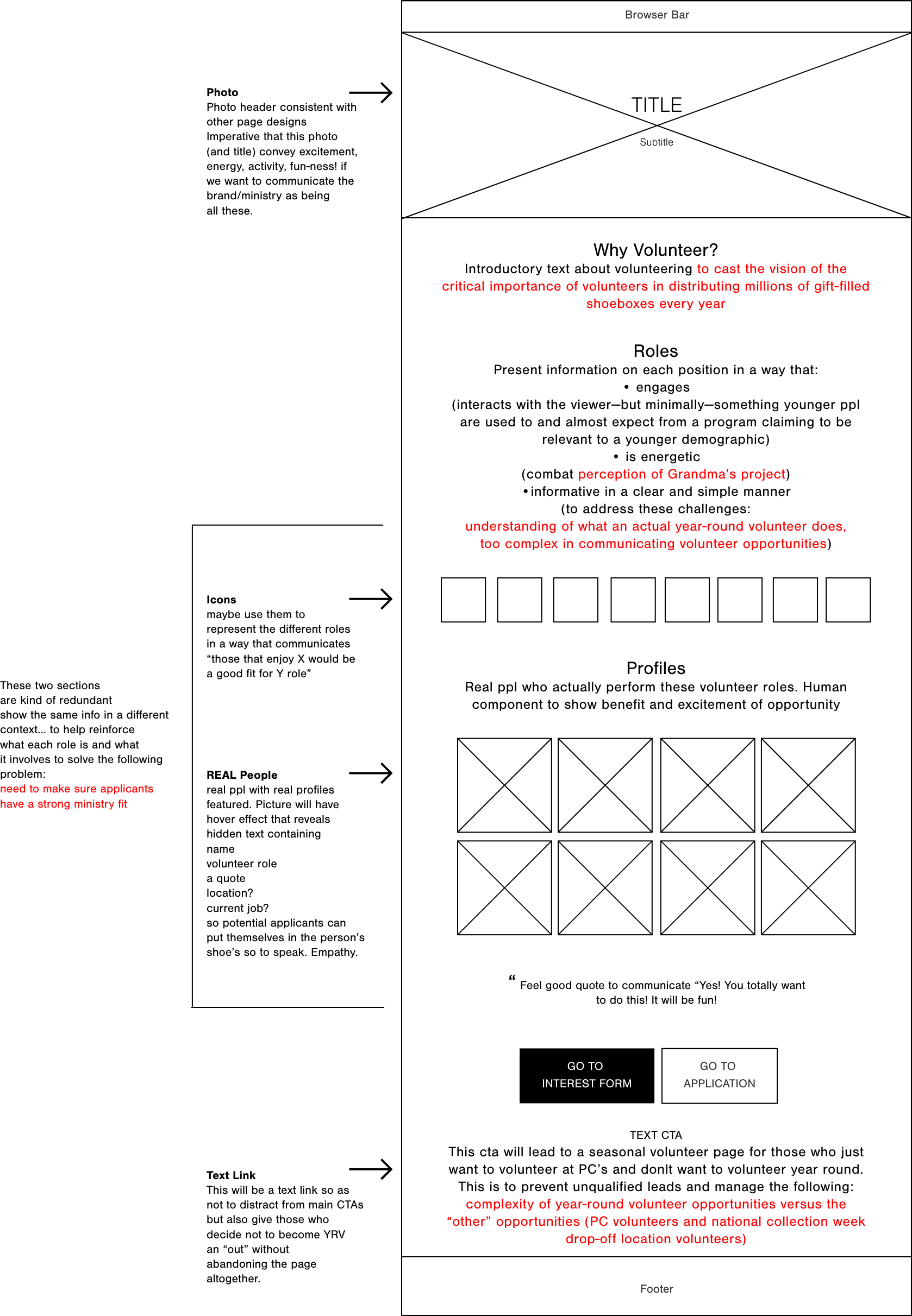
CONTENT STRATEGY
- The “why” behind volunteering with OCC. The critical importance of a volunteer in this ministry
- What it’s like being an OCC volunteer. What the benefit is and how exciting it is
- Information on each role
- Articles that guide the user to the volunteer role that’s best for them, based on lifestyle, personality, and personal characteristics that are unique to that person, and relate to a specific role
- CTA buttons to interest form and application; emphasis on interest form
- Text CTA to be routed to other vol opportunities
Section 1
Section 2
Section 3
Section 4
0.6
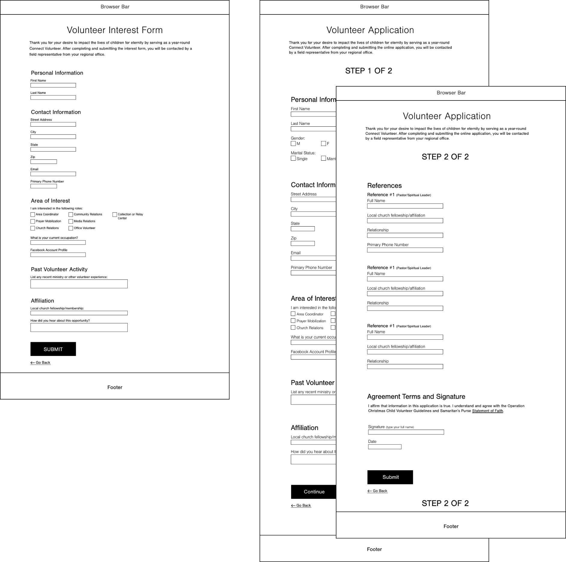
Form Wireframes
Year-Round Volunteering Form and Application
0.7
Production
Year-Round Volunteering Funnel Entry (Homepage)
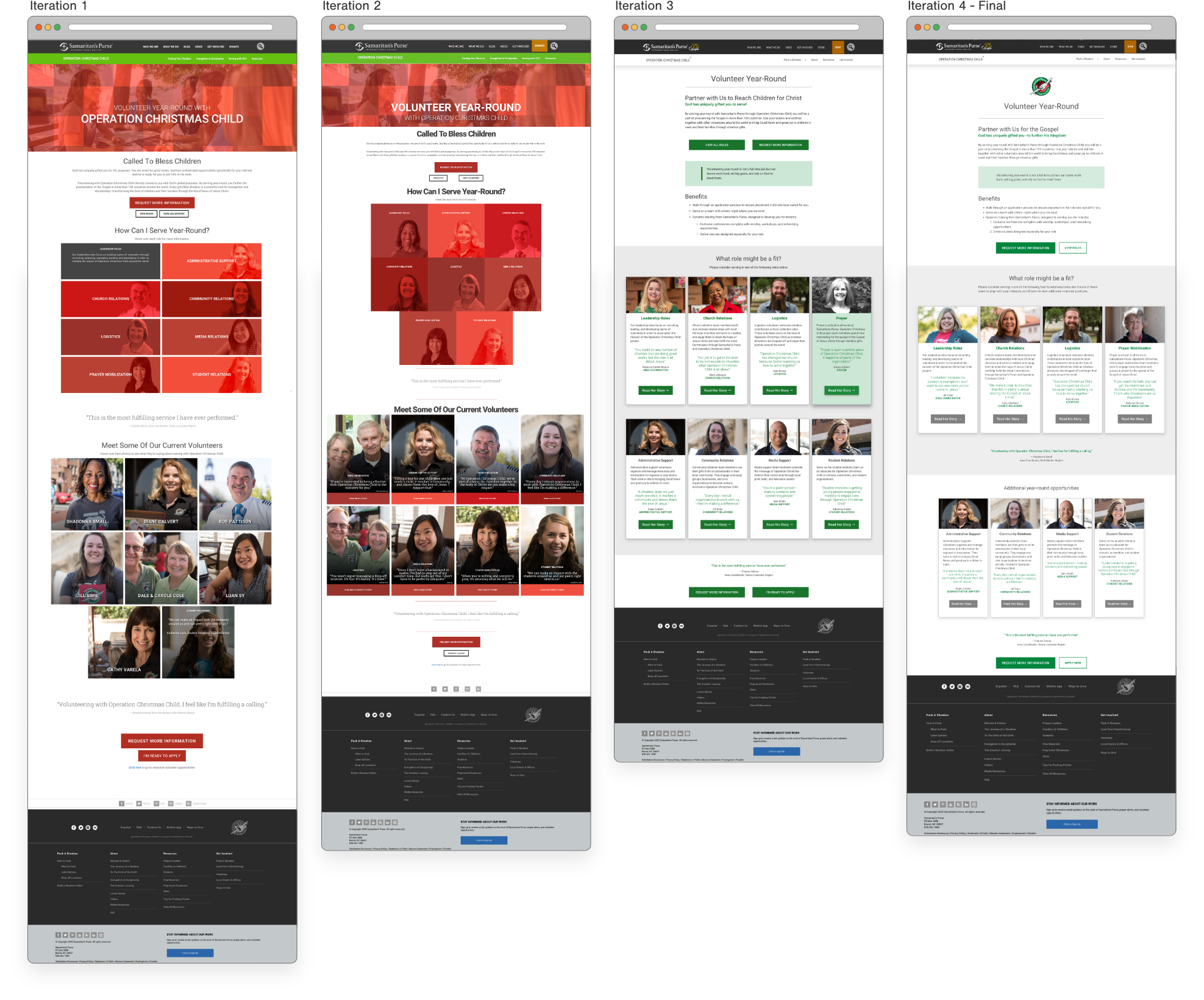
Design Reasoning
The first iterations of the visual design of the deliverables matched the current marketing materials for that year. Eventually, the design was streamlined and standardized, which resulted in the green and gray color scheme and hierarchy detailed in the section below.
The solution was a simple process for the user to move between value-adding content and the forms to eliminate friction and page abandonment.
The homepage became the entry point for the user/lead. It highlights the scope of commitment to participate, links to engagement opportunities (application and interest form), and featured roles which all link to articles personifying each year-round volunteer role.
The first two iterations had rollover text on the “Roles” that gave details about that particular role. I did this to reduce information load when the user lands on the page. Later iterations condensed the information for the role, with a photo and quote onto what came to be known as “role cards”.
For the CTA, the priority was to complete the interest form, so that button is most prominent on this entry page, and on the inner article pages.
0.8
Production
Year-Round Volunteering Interest Form
Design Reasoning
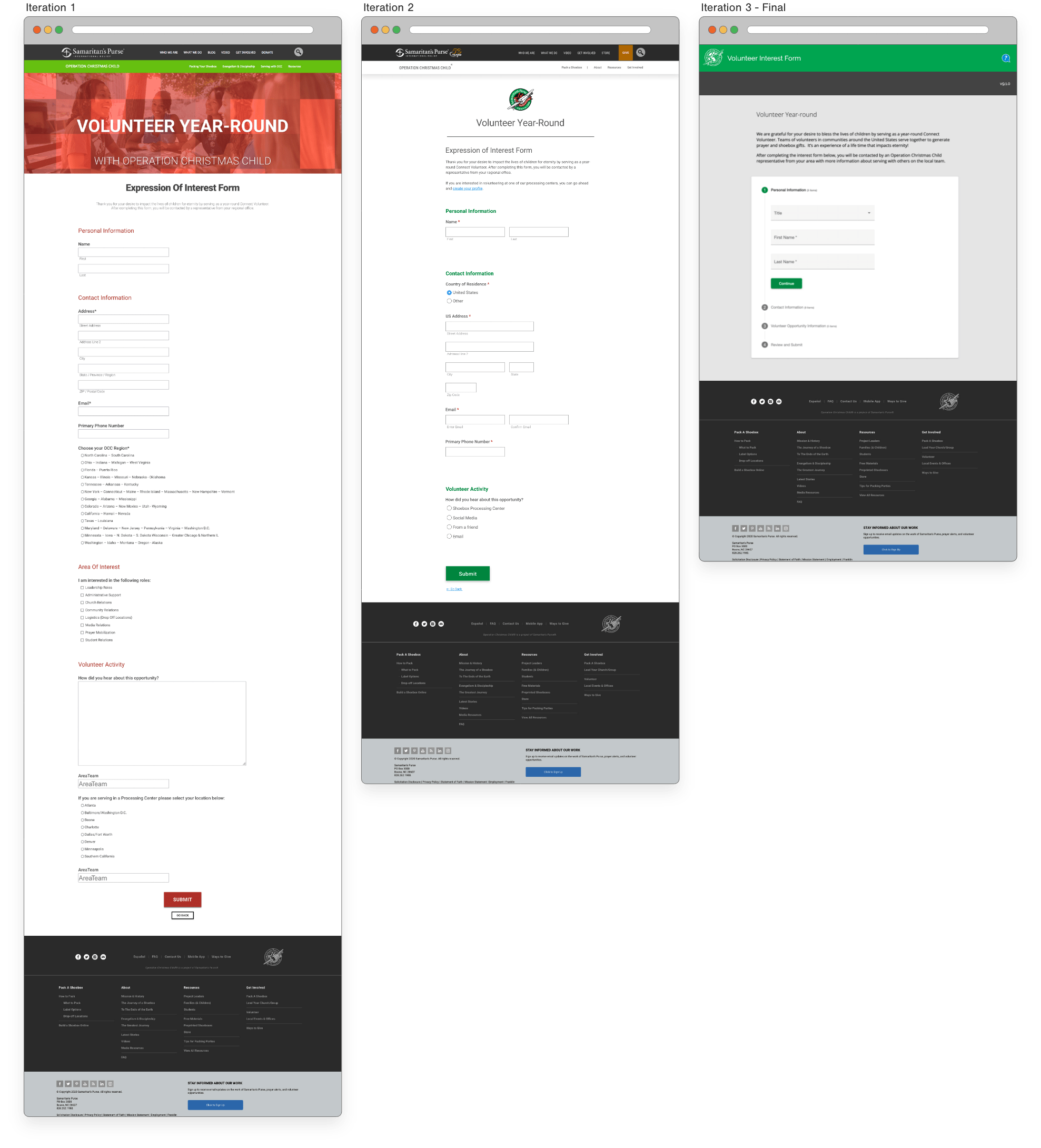
Once I launched the first iteration on the form, I conducted contextual usability testing and found some additional feedback/cues that needed to be incorporated into the form.
Additionally, I was able to reduce the amount of choices (decision fatigue) given to the user in Iteration 2.
In Iteration 3, the idea of progressive disclosure really hit home with the stakeholders.
Changes I made to the interest form included:
- Request only information needed; reducing the form from 2 pages to 1 page
- Branded design and interactions for a cohesive experience with related web pages/content
- Now housed on the extranet, for back-end data collection purposes
0.9
Production
Year-Round Volunteering Application
Design Reasoning
Once the user clicks through the various funnel prompts leading to the application, they will be directed away from the WordPress site, which is my domain, to the company’s extranet which is managed by a different department. The year-round volunteer application lives on the company’s extranet, allowing for less flexibility and control over the user journey and interface design.
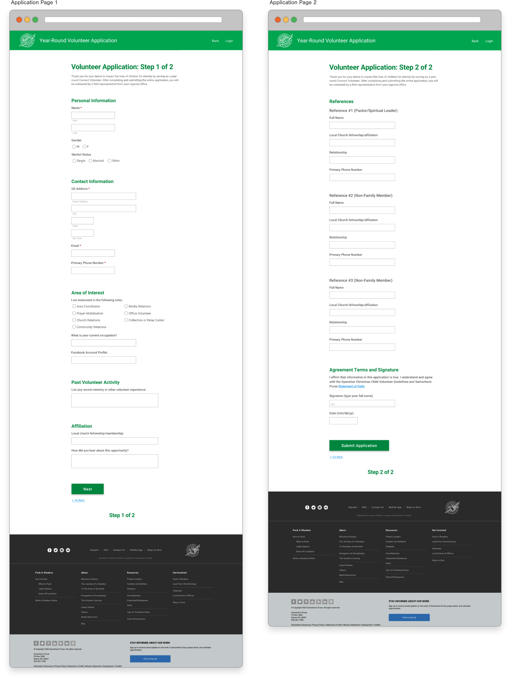
In order to increase conversion rate and not overwhelm the user, I made decisions on what to eliminate and tried to par things by focusing on the most applicable and targeted questions. The end product was a considerable improvement.
Changes I made to the application included:
- Simplified application to only require information necessary to determine if the applicant was suitable for the role for which they were applying
- Restructured the instructions from 2 pages to 1 paragraph, thereby reducing the application from 5 pages to a manageable 2 pages
- Branded design and interactions to create a cohesive experience with related web pages/content
1.0
Typeface & Color
Year-Round Volunteering

1.1
Retrospection
Year-Round Volunteering
WHAT I WOULD HAVE DONE DIFFERENTLY
I would have made the on-page affordances more discoverable. I don’t think the signifiers and constraints came out as strong as they could have. My initial mock-up contained patterns for hover/click-able items. This interaction pattern did not make it to the Production Phase 1, nor was it replaced by an alternate pattern.
Grid didn’t exist during the initial project stages, so I used Flexbox for a lot of my layout. The latest iteration used Grid and Flexbox.
I would have covered my bases with Flexible Boxes layout more thoroughly. I’m the only one on my team that learned and used both Flexbox and Grid. I began using them because the browser support is pretty solid now.
Downside: if I discover a rendering bug I cannot ask my team for help since I was the only one implementing these layout modules. This put pressure on me but it also enabled me to grow and learn as I sought a solution; thus becoming more familiar with the new and deprecated Flexbox spec.
1.2User Feedback & Research
Year-Round Volunteering
QUANTITATIVE RESULTS
- BEFORE REDESIGN: 13.69 average # of users a day completing and submitting form
- AFTER REDESIGN: 35.18 average # of users a day completing and submitting form
QUALITATIVE
Usability TestingUser feedback
- “…engaging personal content and fun/easy navigation. – Manager
- “LOVE the new year round volunteer website—it is first class!” – Office Staff
- “Very easy to navigate and very informative. A great tool!” – Office Administrator
- “This looks just beautiful! So clear, easy to navigate. GREAT! Great!” – Director
- “Very cool! A website I will be proud to navigate potential volunteers to.” – Local Area Strategist
Warehouse 12/07 • Year-Round Volunteer Page
- **Being used in Landscape mode when Portrait was anticipated in design**
- Before signing-up was “a confusing process” when year-round volunteering opportunities were announced
- New proactive approach much easier to engage our prompt or promotional piece via banner on OCC homepage and sub-nav menu item
- No knowledge (level of user knowledge)
- buttons unclear of how long to tap
- unclear of what buttons to click on to go to interest form [“what do i do to fill it out?”]
- Area Team Contact Info
- Some are interested in contacting the regional contact about Q&A, should we provide that info?
- Email Required
- Becomes a barrier to entry, but this is understood and a desired barrier
- Directly to form
- Volunteer Page serving as an access point, not an information page
- Most people want to skip the Volunteer Page and go directly to the Interest Form
- Content Sections
- Distinguishing content not intuitive, or well understood what each provides
- Role Descriptions
- Text cut off in descriptions
- Text is way too small to read in descriptions
- Text running over faces
- “Stress Partnership with OCC”
- Need to clarify expectations
- Summary of what is desired from the volunteer in terms of time and resources should be clarified.
- Concern with overcommitting to volunteer role with full-time job or full-time student, busy schedule
Warehouse 12/07 • Year-Round Volunteer Form
- Top image too tall-can be half the size
- Form keyboards should change per form input type, can we do this?
- Zip code display # keyboard — form input determines keyboard type
- Check Boxes and Radio Button Size
- Older users struggled to read and to select the correct input “I can’t see well” (they blamed themselves)
- Unclear of what buttons to click on to go to interest form [“what do i do to fill it out?”] — Way too small for iPad users in persona demographic
- Required email is a desired and performant barrier to entry
