Boosting User Engagement
GOAL
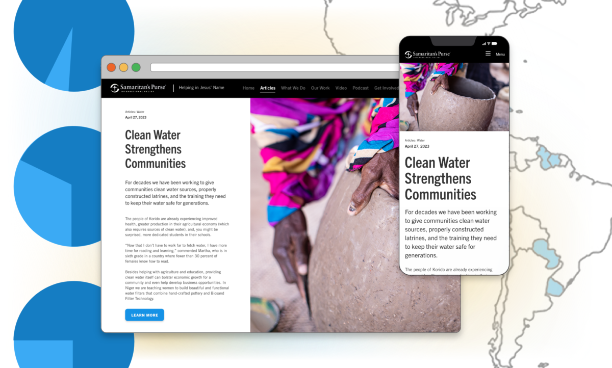
A ministry wanted to showcase some of their biggest projects, highlighting the impact the projects have had in various parts of the world. To achieve this, the ministry needed a clean and engaging approach to the design and function of these articles. Specifically, the client was looking for longer on-page viewing time, while demonsrating to donors the impact of their giving.
APPROACH
In order to create more engagement from users, I added needed value discovered during the research phase (i.e. what appeals to the user’s interests/goals) where it was lacking and added interactive/feedback elements.
SOLUTION
The solution was two-fold. First, we decided on a mobile-first approach to the design. Read below to learn why… Second, we decided to redesign the navigation simultaneously to fit the mobile-first approach.
PAGE CONTENTS
0.1
Mobile First Design
Project Articles
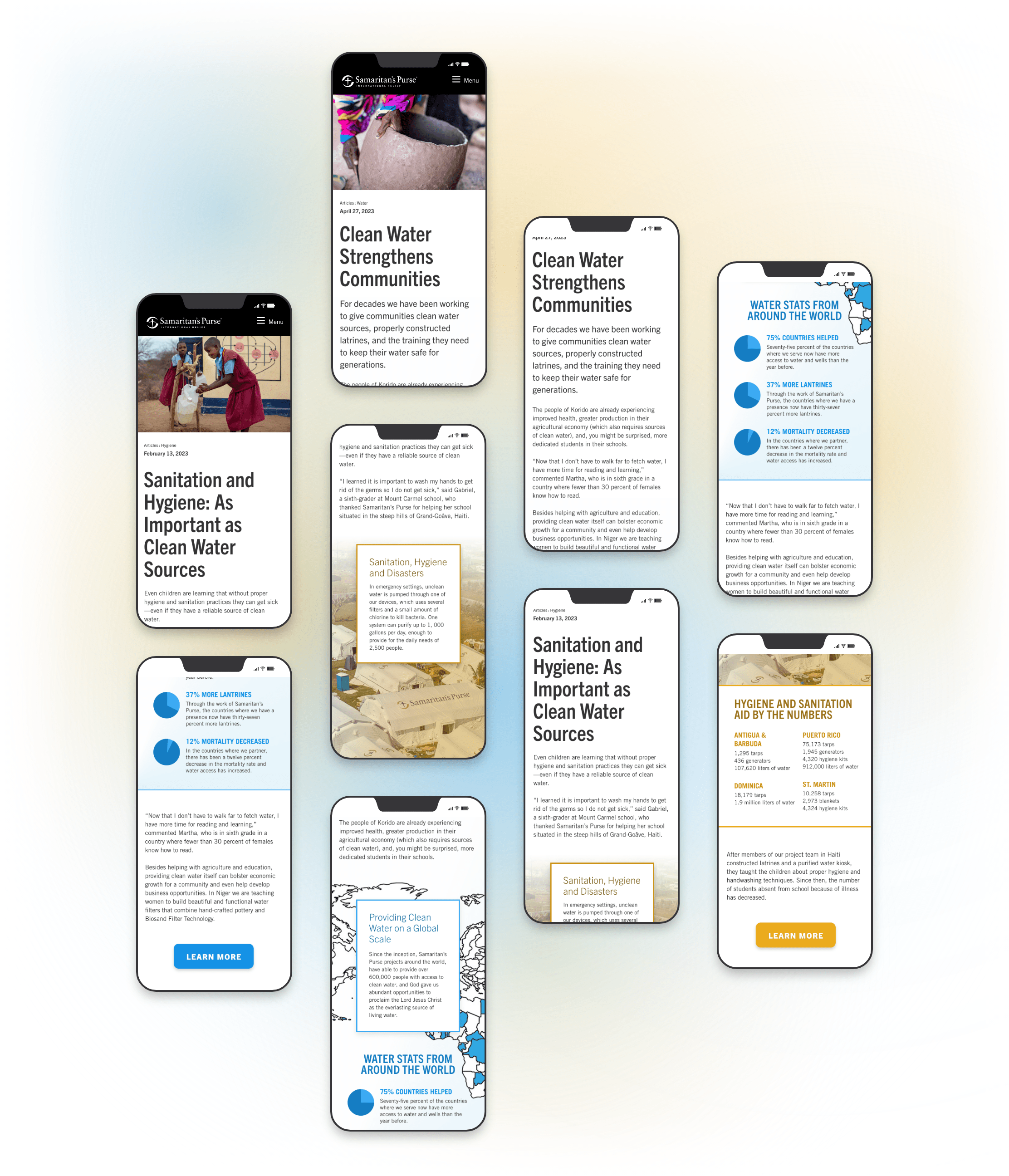
I started with a mobile-first design because it was a legacy company and I found mobile-first was an effective way to demonstrate the need to reduce competing content. This enabled a much easier transition to a cleaner design… because only so much can fit on a phone. We were able to narrow down the elements to what was most important to the user and to the company.
Our research revealed the navigation was problematic, and a restructure and redesign was integrated into the mobile-first redesign. Because the site architecture is such a legacy product, it is easier to address these components incrementally. Eventually the whole site will get an information architecture and design overhaul, but we weren’t there yet.
0.2
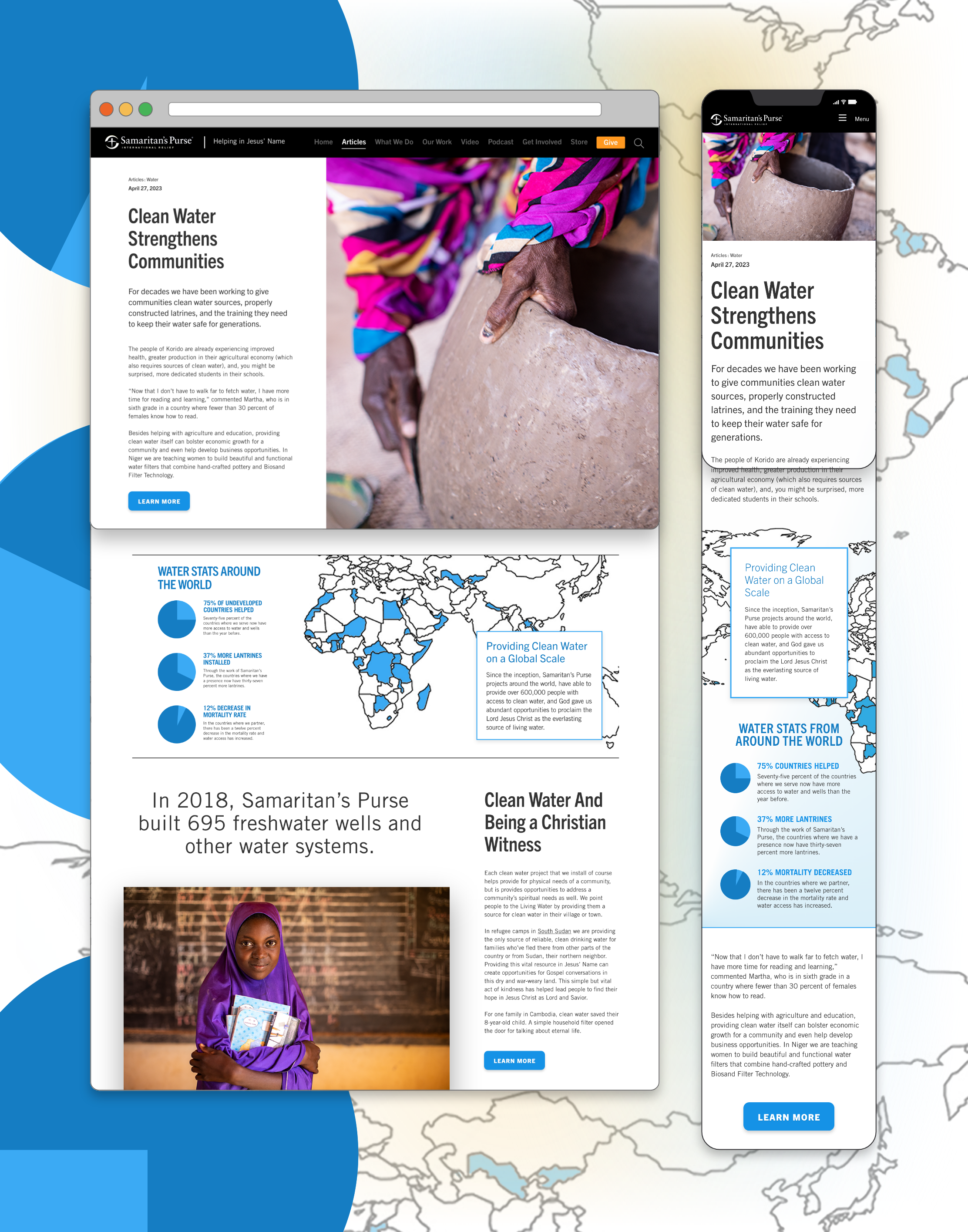
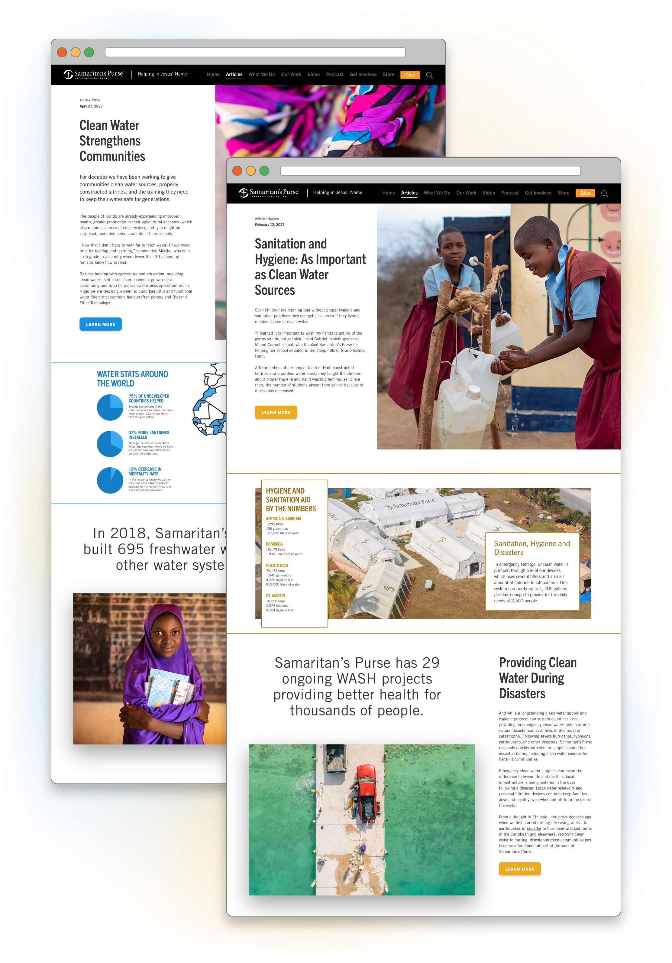
Desktop Versions
Project Articles
0.3
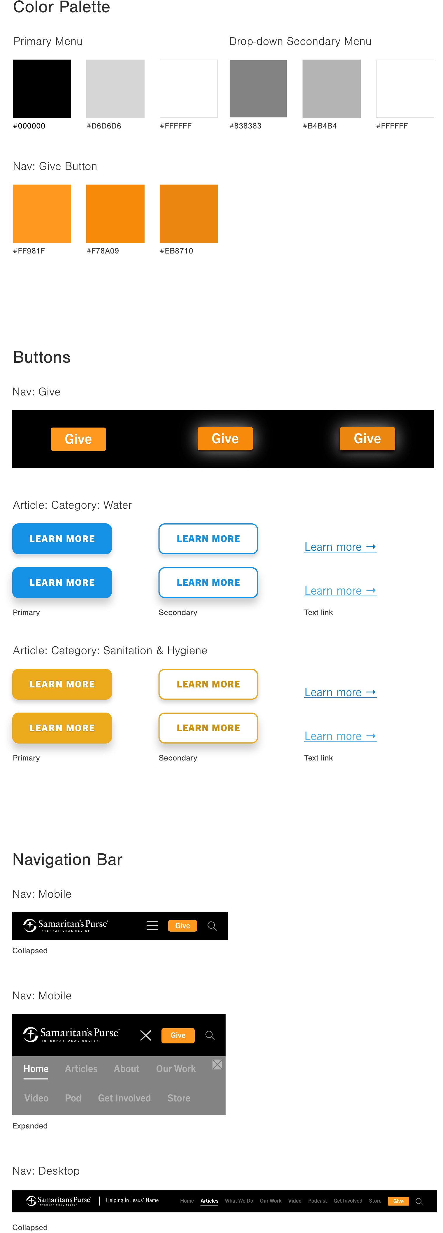
Styles: Typeface & Colors
Project Articles

0.4
Styles: Interactive Elements
Project Articles
