From a Concert Activation to a Global Omnichannel Rollout
MY ROLE
- Principal Designer
- Design Manager (Design System strategy and deployment)
SCOPE
- Multi-year product evolution (Q1 2025 — Q4 2026)
- Moving from an initial "Day 0" tactical execution into global enterprise scaling
- Design System pattern deployment
OUTCOMES
- -23% 30-day cancellation rate
- -0.5% 90-day cancellation rate
- +57% Day 0 photo uploads
- +92% total completion rate
- +80% component standardization across channels
TL;DR
The Challenge
A profound disconnect existed between customers in the United States and the children they were funding globally (through medical, education and other services), with both parties often questioning if the other was even a real person.
Because the traditional long-form letter was rarely leveraged, seeing less than a 20% success rate, communication was nearly nonexistent, leaving children feeling like their sponsor was a "ghost" and sponsors feeling like our organization was disingenuous. This led to monthly sponsorships (a subscription model) plummeting during the first 30 — 90 days.
We needed to establish immediate donor trust and authenticity and make early correspondence feel natural and effortless.
The Solution
I designed a post-checkout experience for concert sponsorships that transforms a transactional purchase into an immediate two-way connection. The reciprocal exchange instantly flips traditional expectations—proving the child is real, establishing trust, and creating authentic mutual joy on Day 0.
Upon it's success, I was able to help guide the team from a "Day 0 experience" to a strategically orchestrated expansion across the entire enterprise, furthering my goal to align our products and experiences to a cohesive Design System, regardless of channel or platform.
Creating an Immediate Emotional Anchor
The days following a child sponsorship are critical. Donors have just made a profound, recurring financial commitment to provide food, clothing, and education for a child in a developing country. Yet, the emotional payoff of that commitment can feel distant or delayed.
Initially, this project began as a specialized, post-checkout activation designed strictly for live concert events. The goal was to close the geographical and emotional gap between the donor and the child instantly.
I designed a digital-to-physical engagement loop. Immediately after purchasing a sponsorship at the venue, donors were prompted to take a photo and answer a topic-specific question. This digital package was then sent to their newly sponsored child, who would later return a photograph of themselves physically holding the donor’s picture, along with a personalized response.
The organization currently has 3 different checkout platforms, based on application. Because our design system did not exist at the time of inception, the concert platform established it's own dark-mode design, accounting for it's departure from the org's other checkout experiences (this is addressed in the global rollout).
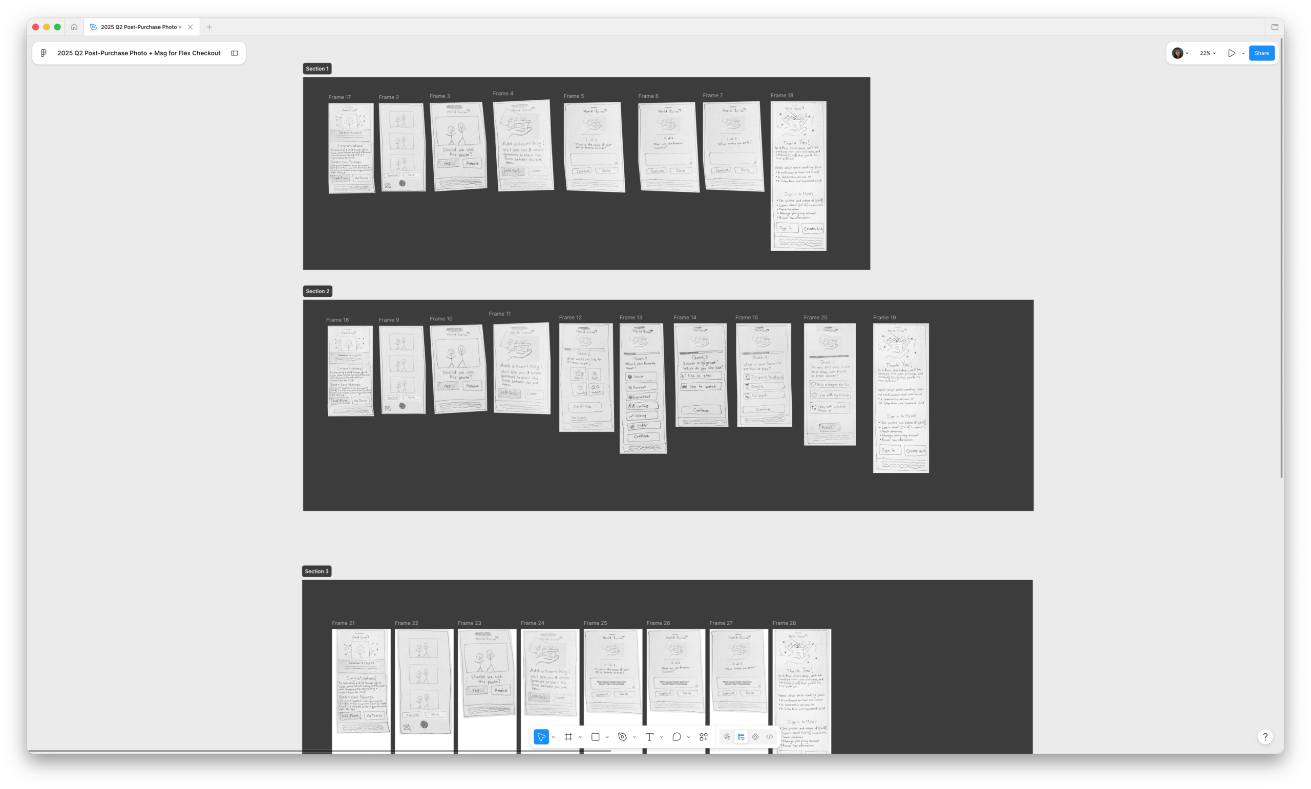
Post-checkout experience concept sketches for prototype user testing in Figma.
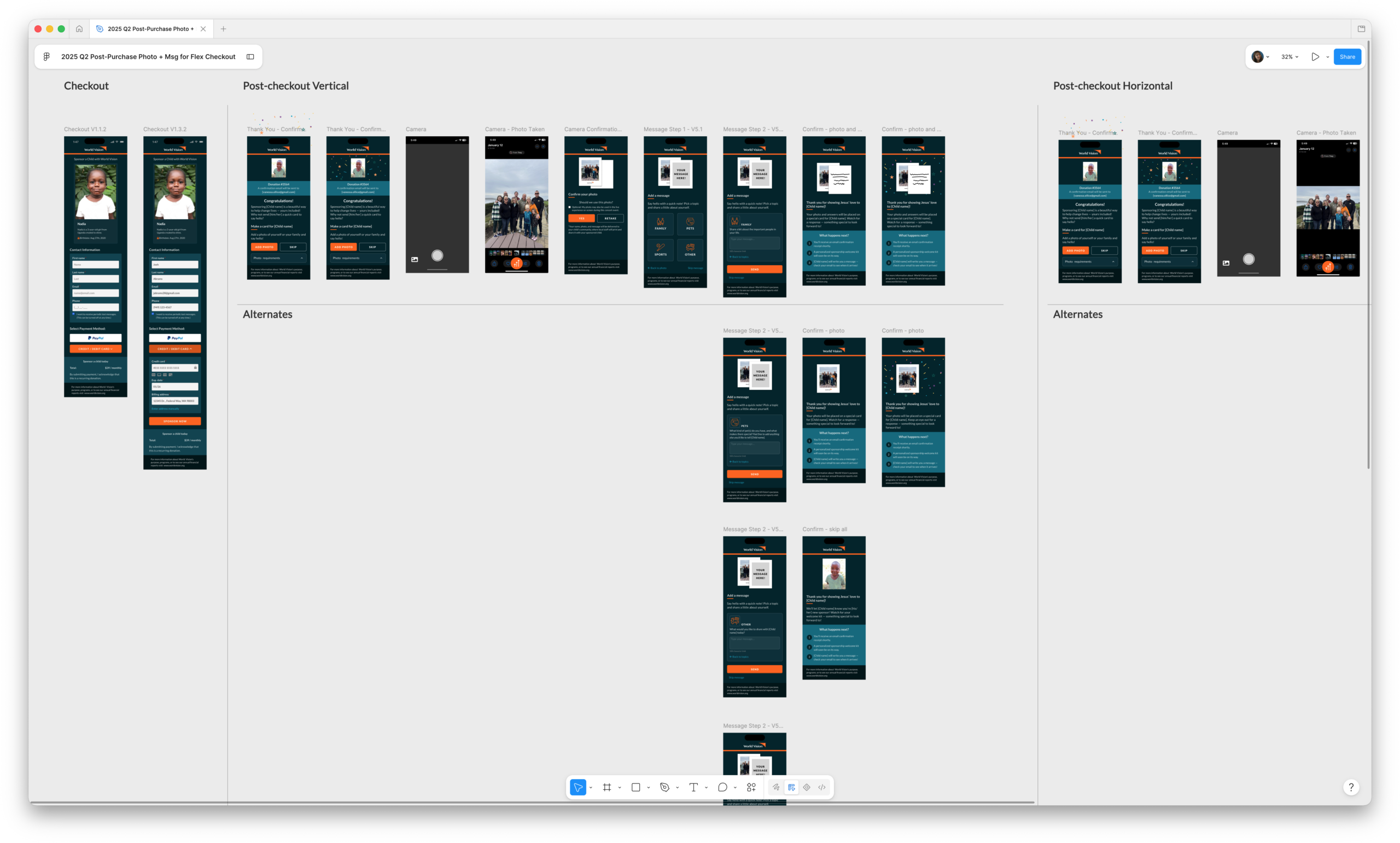
Concert-specific design of post-checkout experience in Figma.
Proving Value
-
High Engagement: Post-checkout engagement was high and increased over time, with 57% of users uploading a photo and 92% of those that uploaded a photo also adding a message.
-
Reduced Cancellation Rate: Reduced overall cancels by 0.5% which translates into millions of dollars in captured revenue.
- Improved Corporate Reputation: Demonstrated to users that their sponsored child is real and the impact of monthly giving is tangible, while showing the children that their sponsors are not "ghosts".
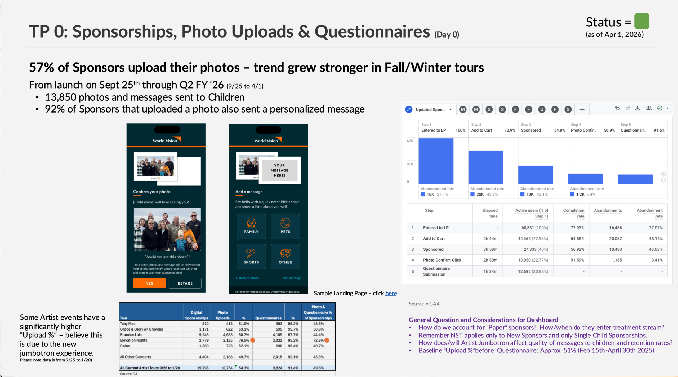
Powerpoint share-out of results.
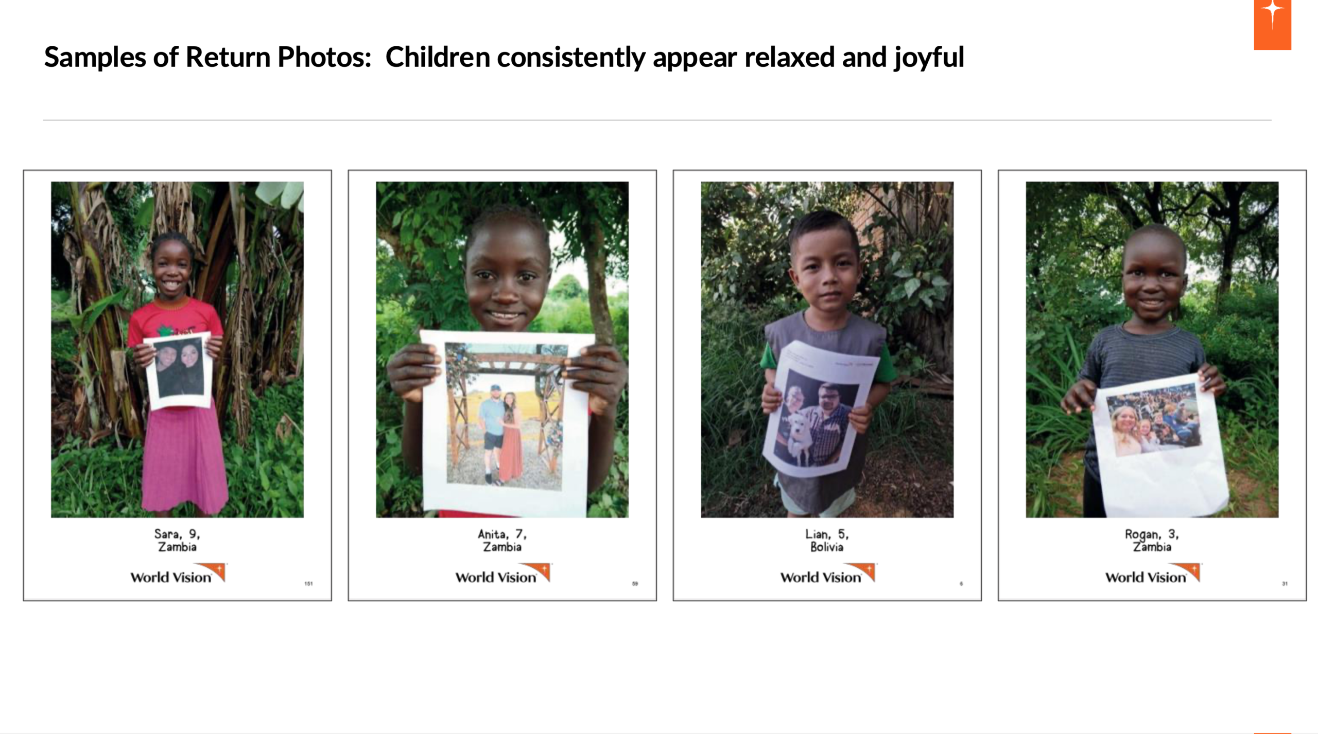
Share-out demonstrating qualitative success.
Omnichannel Scaling
The scaling process happened in strategic phases. First, I adapted the experience for post-purchase email prompts, effectively translating the concert energy into an asynchronous digital touchpoint. Next, I expanded the architecture to dedicated landing pages.
During the first adaption, we had to align the design with the rest of the donor experience touchpoints in this treatment stream. That meant, a second visual design would need to be maintained, creating design and tech debt, although the functionality had not changed. Although scope didn't allow us to address this at the time, this began to expose some of the cracks in our infrastructure that resulted from not having a systems approach to our enterprise platforms.
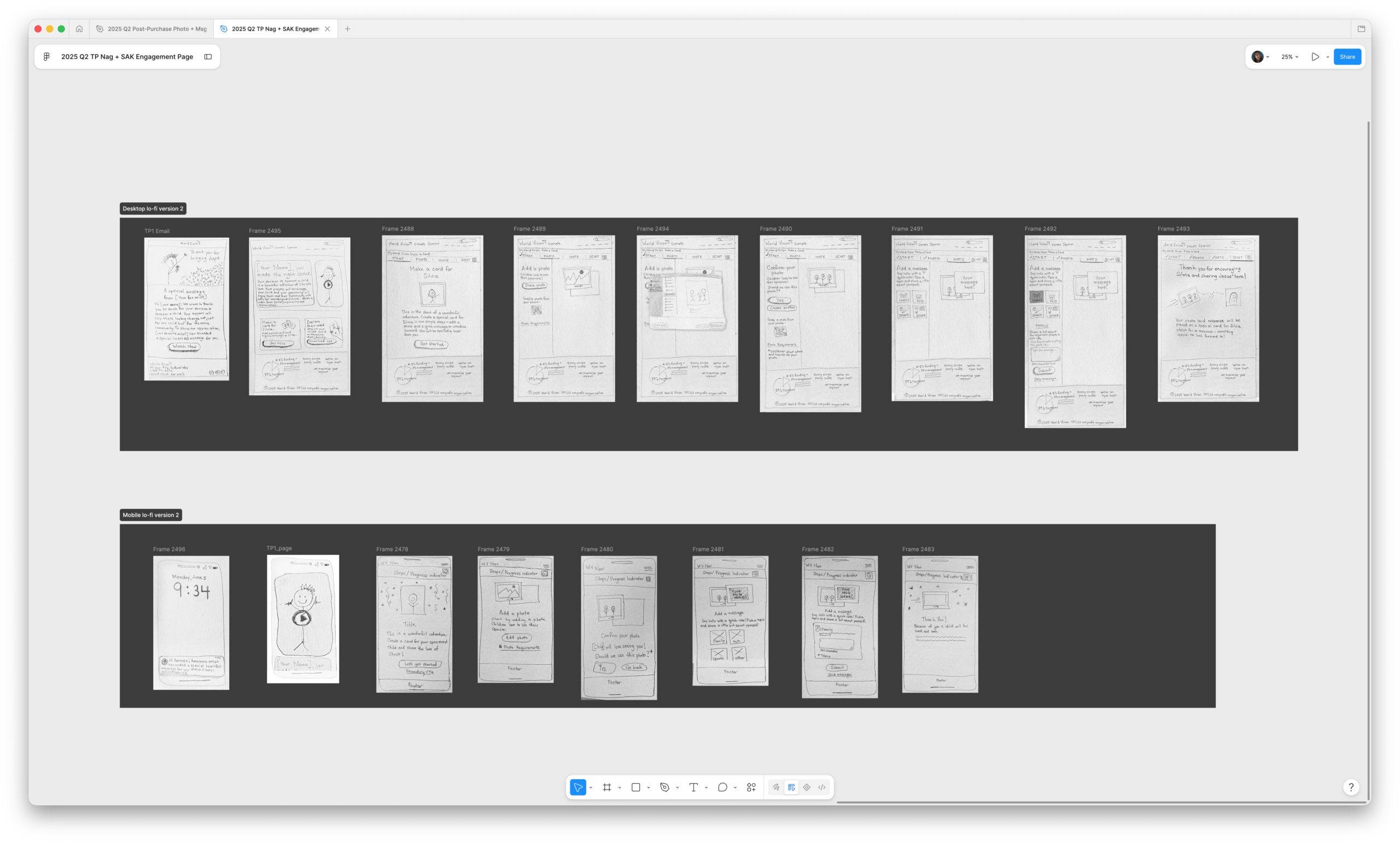
Post-concert web photo + message concept sketches for prototype user testing in Figma.
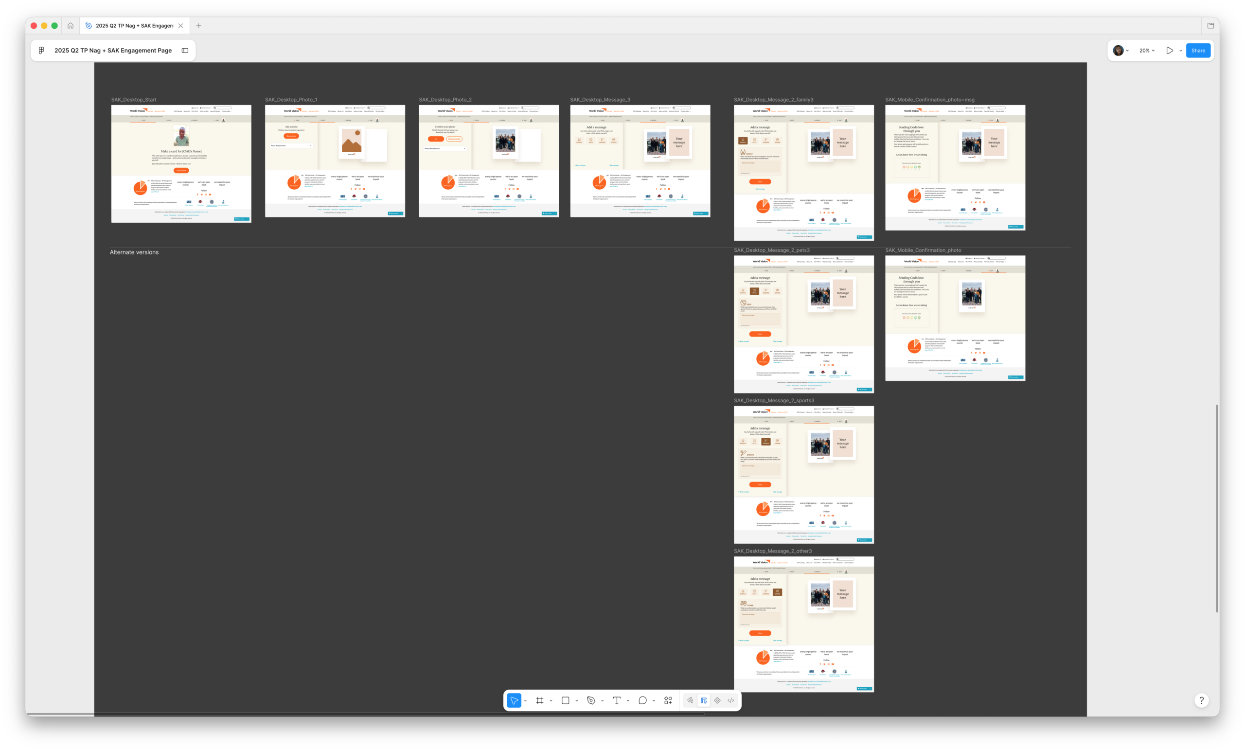
Post-concert web photo + message experience in Figma.
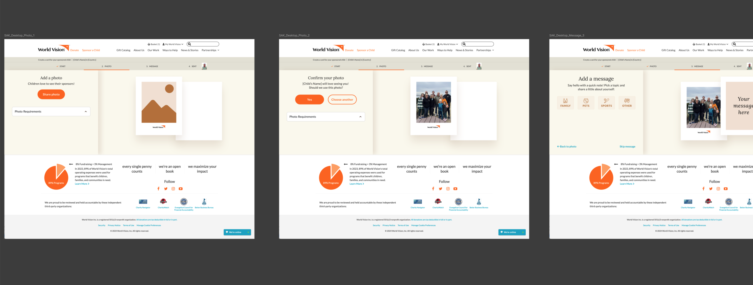
Close-up of post-concert experience, in Figma.
Finally, we chose to scale the experience into a complete global rollout across our primary site cart checkout. The goal was no longer just for concert-goers, but to ensure that anyone—whether they were at a church event, on a mobile device, or sitting at their desktop computer—could experience this immediate connection.
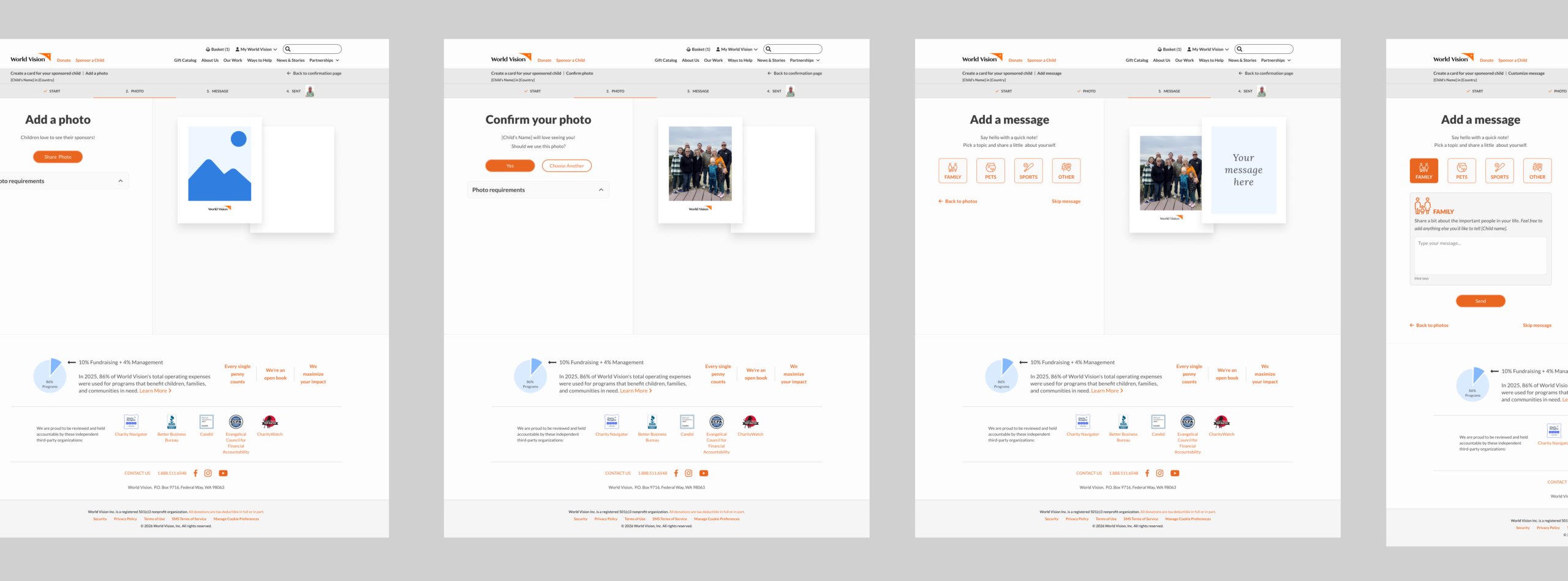
Close-up of subsequent, post-checkout experience if user clicks on the "create a card for your sponsored child" modal feature on the FOS confirmation page (desktop version).
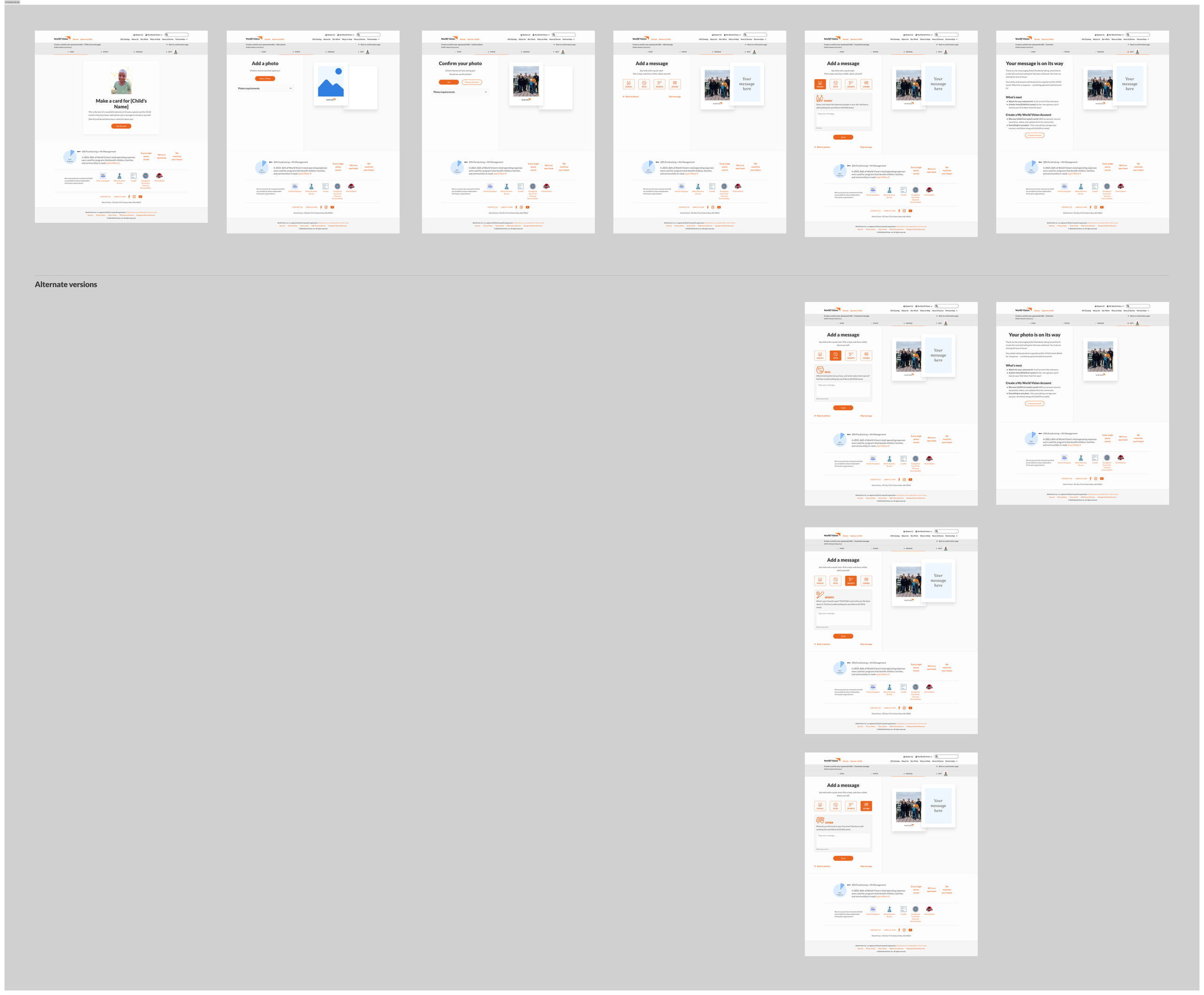
Full redesign of flow in Figma (desktop version).
Harmonizing Bespoke Experiences
with the Design System
Scaling a highly specialized engagement tool across a global platform required rigorous alignment. As the Principal Designer and Manager of our design system, I had to ensure that integrating this new, multi-step, post-checkout flow didn't introduce technical debt or visual fragmentation into our core checkout environment.
I identified a key application opportunity to redesign the front-of-site post-purchase confirmation page, ensuring a seamless, system-driven user experience while directly tackling early customer churn.
The shopping cart experience was being redesigned to match the design system, which would make the post-purchase confirmation page distinctly different than any other part of the shopping experience – further fragmenting our user experience across enterprise products.
Both business units had their objectives and agendas. The key to successfully scaling this application would be my ability to position the design system as a positive constraint for both.
I framed the redesign of post-purchase confirmation page as a strategic opportunity to deploy the design system and solve a core business challenge that both business units faced – inconsistent brand experiences.
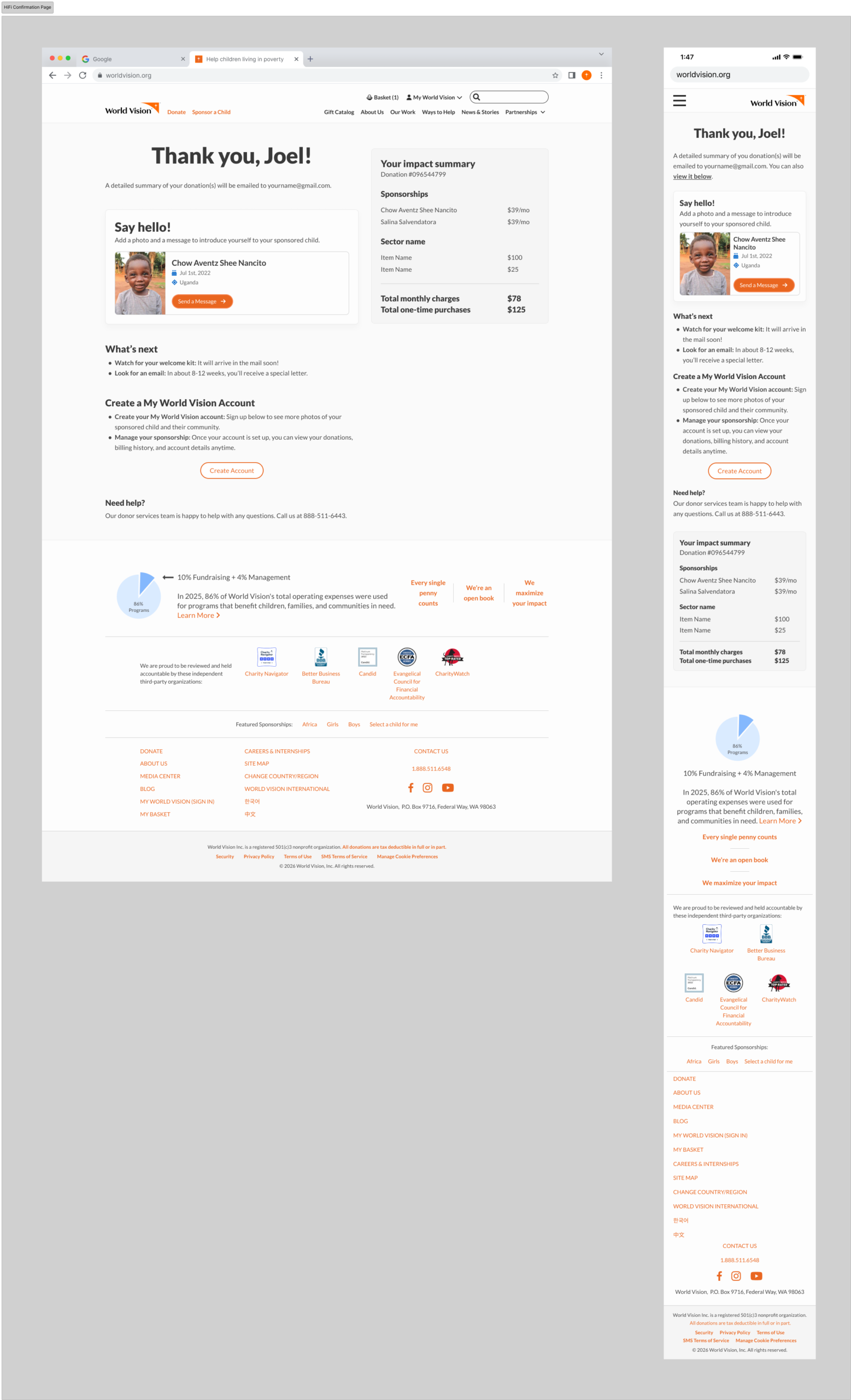
Close-up of front of site confirmation page, displayed after checkout (desktop and mobile versions).
Before & After
Previous versions compared to final, evergreen design system version, scaled across contexts and promotions.
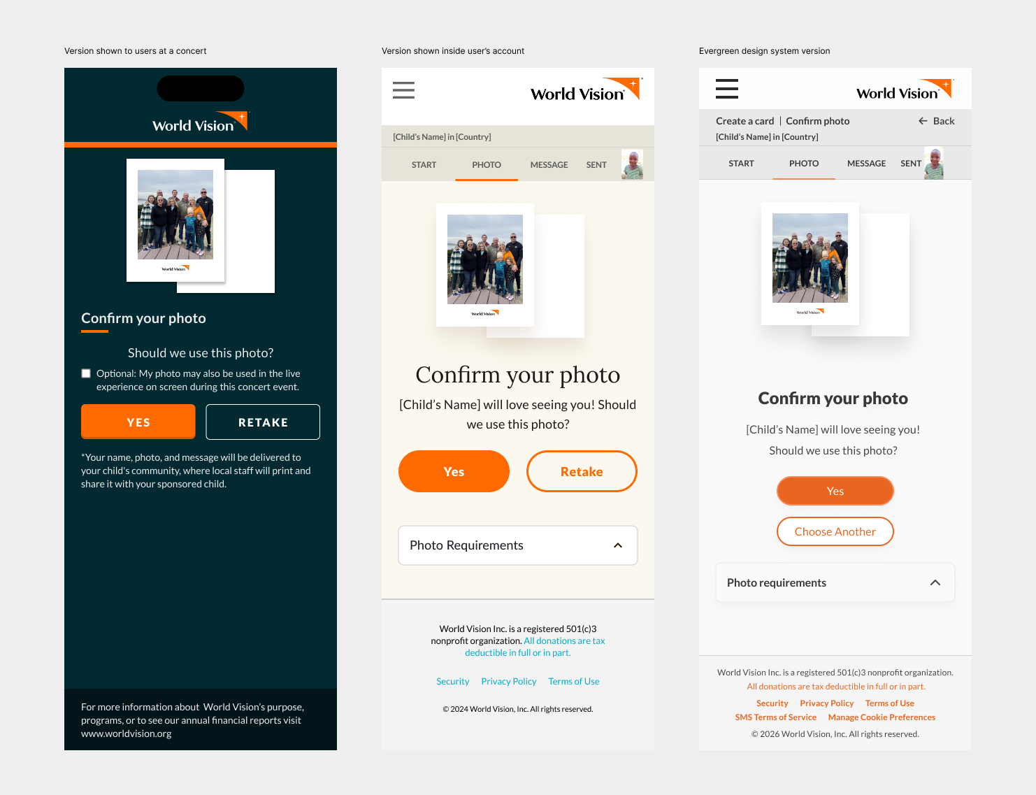
Left to right: Confirm your photo (mobile) screen, from the first use case through to the design system evergreen version.
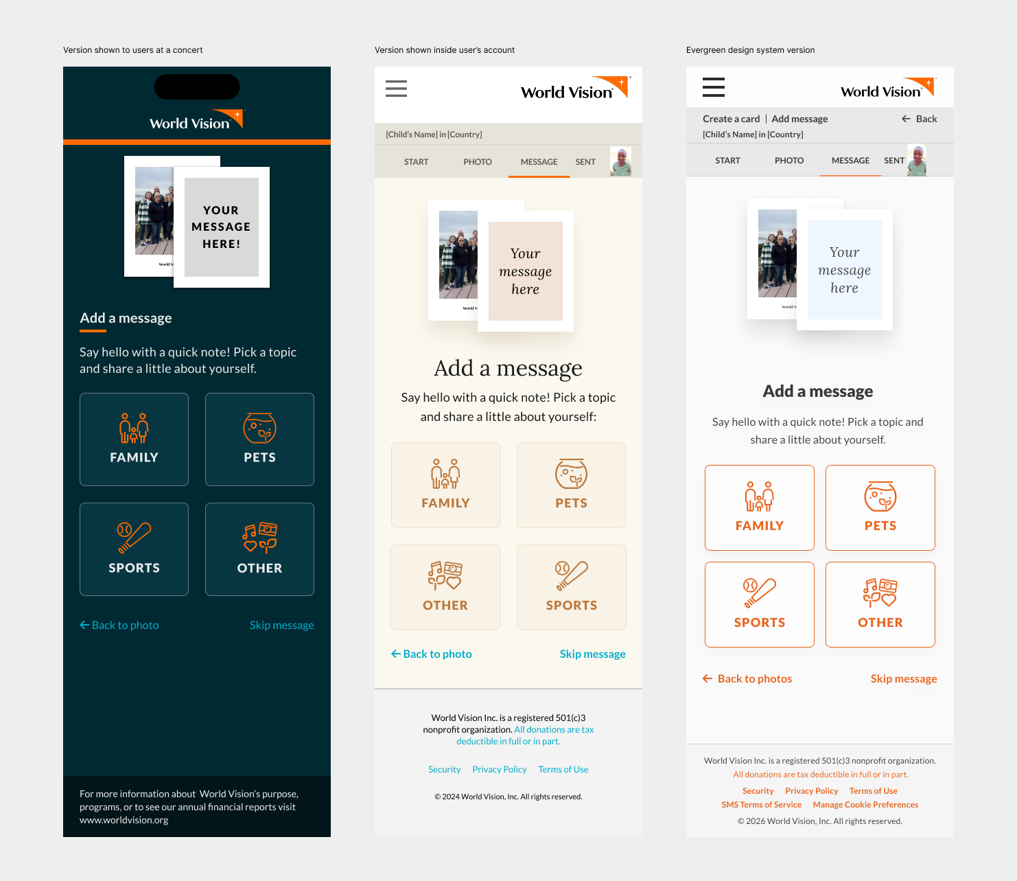
Left to right: Choose a topic to reveal a prompt that will help you write a message (mobile) screen, from the first use case through to the design system evergreen version.
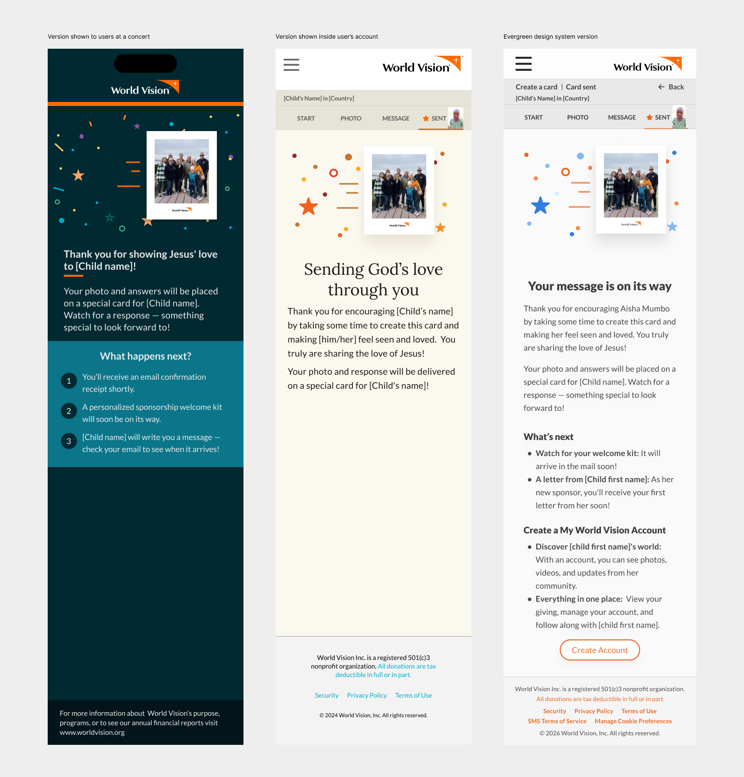
Left to right: Confirmation (mobile) screen, from the first use case through to the design system evergreen version.